

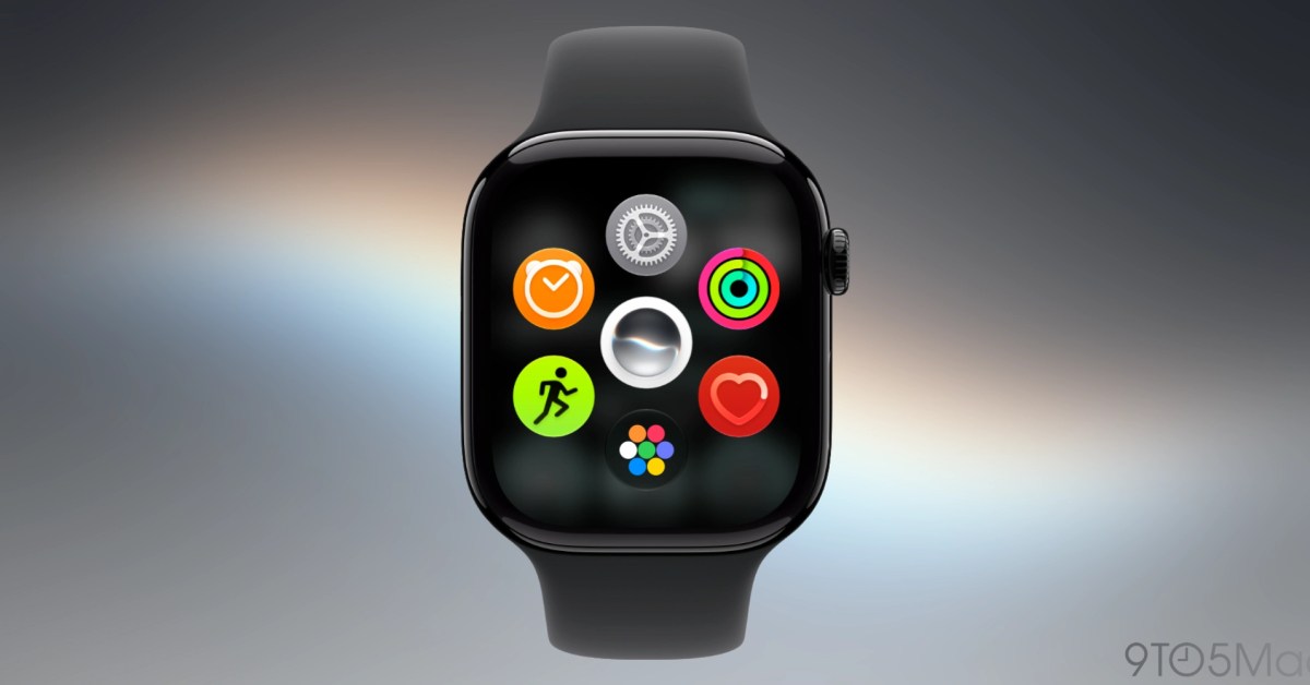
When watchOS 27 is released later this month, Apple Watch users will notice that some familiar features have disappeared. The upcoming software update removes three notable elements: the Walkie-Talkie app, the Digital Crown double-click multitasking gesture, and the traditional single-click app launcher behavior. Each change alters the Apple Watch experience in meaningful ways, and some users may miss what these features offered.
Apple has positioned watchOS 27 as a refinement of the platform, with a stronger focus on intelligence, Siri integration, and streamlined interactions. But for those who have grown accustomed to certain workflows, the removals can feel like a step backward. Below, we break down each eliminated feature, why Apple might have removed it, and what it means for day-to-day usage.
Walkie-Talkie removed from Apple Watch
The Walkie-Talkie app has been part of Apple Watch since watchOS 5, introduced in 2018. It uses real-time push-to-talk over FaceTime audio infrastructure to allow two Apple Watch users to communicate instantly, much like a two-way radio. The feature is exclusive to Apple Watch, meaning you can only talk to other people wearing an Apple Watch.
In watchOS 27, the app has been removed entirely. This means it will no longer appear in the app list, and any shortcuts or complications tied to it will become non-functional. Users who relied on Walkie-Talkie for quick communication with family members or colleagues while on the move will lose that ability. Unlike a phone call or standard messaging app, Walkie-Talkie was always on and required no tapping to answer—it worked more like a direct intercom.
Personally, I never found Walkie-Talkie indispensable. Leaving it enabled meant having a yellow icon constantly on the watch face, which some users found visually intrusive. That said, for those who used it in real-world situations, its removal is already being felt. A feature that enabled instant connection between an Apple Watch and another Apple Watch is not easily replicated by third-party apps, because it relies on deep system integration. A third-party implementation would need persistent background audio, immediate notification handling, and a user interface that is always accessible—all challenging to achieve with current watchOS APIs.
Some observers have suggested that Apple could bring Walkie-Talkie back as a cross-platform feature, working on both iPhone and Apple Watch. That would make it more useful, because it would no longer limit communication to just Apple Watch owners. However, Apple has made no such announcement. For now, users who depended on Walkie-Talkie may need to fall back to FaceTime audio calls, phone calls, or third-party apps like Telegram or WhatsApp that offer voice messages, but none of those deliver the same immediate, walkie-talkie-like experience.
Multitasking shortcut is missing
Another major change is the removal of the Digital Crown double-click gesture that previously opened the app switcher. Starting with watchOS, double-clicking the Digital Crown would let users quickly switch between their most recently used apps, similar to double-clicking the Home button on an older iPhone. This made it possible to jump back and forth between two apps without digging through the app launcher or using Siri.
In watchOS 27, double-clicking the Digital Crown now does exactly the same thing as a single-click: it returns the user to the watch face or triggers the current home screen behavior, depending on where you are. This change eliminates a workflow that many users found useful for tasks like checking a message while using a workout tracker, or glancing at a calendar while on a timer.
I first noted this removal in my watchOS 27 public beta preview, and again in a follow-up article yesterday. The fact that double-click now mirrors single-click seems like a placeholder behavior, not a carefully designed decision. I suspect Apple is still deciding what double-click should do going forward. But in the meantime, users are left with no way to jump directly between two apps. The app switcher can still be accessed via the Dock if it is configured to show recent apps, but that requires more navigation and is not as fluid as a simple double-click.
Given that the Apple Watch has only two physical buttons—the Digital Crown and the side button—each gesture should serve a purpose. The side button can be double-clicked to access Apple Pay or control center, depending on settings. The Digital Crown double-click had a unique role. Now there is no distinct action for double-clicking the Digital Crown, which feels like a wasted interaction. I would like to see Apple assign a new function to that gesture, perhaps opening the app library, activating a specific Siri shortcut, or toggling the new dynamic app grid. At a minimum, returning to the app switcher would be the best outcome for users who rely on multitasking.
The removal of the multitasking shortcut seems more likely to be reversed or replaced in future beta updates. Apple often tweaks gestures and controls during the beta period. But if the final release of watchOS 27 leaves the double-click gesture empty or redundant, users will almost certainly voice their dissatisfaction, and Apple may reconsider in a future point release or watchOS 28.
Dynamic app grid always comes first
The third significant change involves what happens when you press the Digital Crown a single time. Since watchOS 1 (originally called Watch OS 1), clicking the Digital Crown from the watch face or within an app has always opened the full app launcher, showing a grid of all installed apps. That was a fundamental part of the user experience. Even when Apple introduced other navigation methods, such as the Dock and Siri, the Digital Crown remained the surest way to get to your complete app list.
watchOS 27 replaces that with the dynamic app grid. Instead of showing all your apps, this new screen presents a small set of five intelligently suggested apps based on context and usage. It also includes the Siri app at the top and an icon that leads to the full app grid. Users can tap that icon or scroll the Digital Crown upward to reveal the complete list of apps, either in grid form or as a list, depending on their chosen view.
The dynamic app grid is a significant departure from the longstanding behavior. It turns an action that once gave immediate access to every app into a two-step process. To reach an app that is not in the dynamic suggestions, you must first tap the grid icon or scroll up, then find the app. That adds friction for users who know exactly which app they want and do not necessarily need algorithmic suggestions.
Apple's reasoning seems to be that apps are not as popular on the Apple Watch as they are on other devices. Many users primarily use a watch for notifications, workouts, tracking, and a handful of frequent interactions—not for launching many different apps. The dynamic app grid offers larger tap targets, fewer visual distractions, and less clutter. It also brings the Siri app more prominently into the interaction, aligning with Apple's broader push in OS 27 updates to make Siri a central part of the operating system across iPhone, iPad, and Mac.
I understand the rationale, and for new users or casual users, the dynamic app grid may be a friendlier default than a crowded grid of dozens of tiny icons. But for users who are accustomed to the old system, it feels cumbersome. If given an option in Settings, I would probably turn off the dynamic app grid and return to the classic full app grid as the immediate response to a single click. Apple does not offer that option, at least not in the current beta. Users must manually navigate to the full grid every time.
There is also a matter of consistency. On the iPhone and iPad, pressing the Home button or swiping up always reveals all apps; it does not first show a small set of suggested apps that requires an extra step to see every icon. Apple Watch's new behavior breaks that consistency. While a watch display has less room than a phone or tablet screen, the old full grid was already workable, with zoomable icons and the ability to change to list view. Replacing a complete app launcher with a suggested-feed-like screen may save time only if the suggestion algorithm is very good. In practice, the suggestions might not always match the user's immediate intent, leading to more scrolling, not less.
Broader context: watchOS changes and missing faces
These three removals are not the only changes in watchOS 27, but they are among the most visible to long-time users. There is also a broader conversation about how Apple handles feature removal on the Apple Watch. For instance, Apple occasionally removes watch faces that users have grown to love. The Explorer watch face, a rugged black-and-orange design that was exclusive to the GPS + Cellular models, remains one such example. Many users still hope to see it return. Removing digital features like Walkie-Talkie or a particular app launcher screen might be more justified if they are outdated or rarely used, but watch faces are highly personal. They can be disabled, changed, and reorganized easily. Existing owners do not need to be forced to lose them. When Apple removes watch faces, it feels less like a necessary product evolution and more like an arbitrary loss.
Still, change of any kind always takes a period of adjustment before it just becomes how things work. I have been running watchOS 27 since the first day of beta 1 in June. For me, losing Walkie-Talkie is not something I notice, losing the multitasking shortcut feels temporary, and the dynamic app grid is a fine default, but cumbersome for speedier users. These are not catastrophic losses, but they illustrate that every operating system update involves tradeoffs. Some users might welcome a less cluttered home screen; others might resent having to take an extra step to access their full library of apps.
It is also possible that Apple will refine these changes before the official release. The watchOS beta cycle is designed to gather feedback and make adjustments. If enough users complain about the Digital Crown double-click gesture being useless, Apple could restore multitasking or assign a new action. If the dynamic app grid is too slow to reveal the app library, Apple could add a toggle. Walkie-Talkie could even be re-introduced in a hybrid form, especially given the company's growing investment in communication features like FaceTime and Messages.
What users can do now
For those who are about to update to watchOS 27, it is helpful to know what will change in advance. Before installing the update, take note of any Walkie-Talkie contacts or shortcuts you may have used. Consider exporting a list of your most-used apps, so you can quickly find them after the dynamic app grid becomes the default. You may also want to practice using the new navigation flow on a test device if possible. The Apple Watch has a steep learning curve, but new habits can be formed quickly.
If you feel strongly about any of these removals, the most productive step is to submit feedback through Apple's official feedback channel or the developer feedback assistant. Apple does monitor user input for upcoming beta updates. The company may not always act on public sentiment, but persistent feedback did help restore certain features in past iOS and watchOS releases. For now, watchOS 27 is poised to ship later this month amid a mix of excitement for new functionality and nostalgia for the features that are disappearing.
Ultimately, the Apple Watch remains a capable and evolving device, even with these three features removed. The core experience of glancing at notifications, tracking health metrics, and using Siri will continue to improve. But the list of missing capabilities serves as a reminder that platform software is never static. Each update brings a new version of what Apple believes is best, and users must adapt, even when it feels as though a familiar part of the experience has been taken away.
Source: 9to5Mac News